If you have ever tried to generate an interface with an AI assistant without giving it concrete rules, you surely recognize the default result:
- Recursive boxing (boxes inside boxes): Outer containers wrapping cards that in turn have duplicated borders, backgrounds, and paddings.
- Generic fonts like Inter or Roboto.
- Purple or gradient buttons with standard rounded corners.
- Disproportionate spacing (meaningless paddings) and endless cloned components.
This phenomenon is known in the industry as AI SlopGlosarioAI SlopTérmino que define la morralla, bazofia o contenido basura generado en masa por modelos de inteligencia artificial sin supervisión ni valor editorial. Proviene del inglés slop (literalmente la comida de desperdicios o sobras que se echa a los cerdos). En la cultura digital representa el sucesor directo del spam: textos inflados, imágenes clónicas, código genérico y relleno algorítmico sin criterio ni alma que saturan internet y provocan el colapso de los propios modelos al retroalimentarse de su propia basura.Ver término completo → ("visual junk").
Where does the term come from? Slop was coined by the tech community and popularized in 2024 by developers like Simon Willison, drawing a parallel with the term spam from the 90s. In web development, it refers to those generic and soulless interfaces that AI automatically generates by default.
The "Recursive Boxing" Vice: Why the AI Fills the Screen with Boxes
One of the visual symptoms that most reveal an AI-generated interface is the compulsive accumulation of nested containers. The model tends to wrap each section inside a large outer card with a border and background, and then boxes each item again within its own border and padding.
This recursive boxing (boxes on top of boxes) creates serious design problems:
- Reduces usable space: Accumulating external paddings in wrapping containers compresses the actual content on screen.
- Generates visual noise: Duplicating borders and background layers breaks the natural hierarchy of the web flow.
- Creates "div soup": Overloads the DOM tree and makes CSS maintenance difficult.
To achieve a clean and professional interface, we must prohibit redundant wrapping paddings in our design contract: content elements (such as accordion dropdowns or information cards) must rest directly on the page flow without unnecessary outer boxes.
To escape this default template, you do not need to change frameworks or learn complex programming tricks. The solution lies in applying a method of guided design: creating a centralized file called DESIGN.md that serves as the aesthetic source of truth for the AI, and making every instruction in your project revolve strictly around it.
Why the AI Delivers Generic Responses: The "One Prompt, Three Jobs" Trap
To understand the solution, we first need to understand what happens inside the model when we ask it for a screen with a vague phrase like "make me a modern and beautiful interface".
Think of the AI as a designer who has studied millions of web pages from all over the internet. When you make an abstract request without restrictions, you are asking it to make three complex decisions at the same time:
- The art direction: Choosing colors, fonts, contrasts, and visual personality.
- The user experience (UX): Deciding the layout of elements and the screen hierarchy.
- The code architecture: Writing the HTML and CSS rules that build the interface.
By forcing the AI to take on all three roles at once in a single message, the assistant applies the default standard response (the average "wildcard" from its training). It chooses the most common fonts on the web and the most common color combinations to avoid risking giving you something that does not fit or fails to compile.
Practical Example: What NOT to Do (Vague Prompt) vs. What TO Do (Guided Prompt)
To visualize with absolute clarity the difference between delegating blindly and guiding the AI, let's analyze the model's behavior facing two requests.
The Wrong Case: The Vague Prompt that Generates AI Slop
When a developer writes a naïve instruction without aesthetic or contractual restrictions, the assistant applies the standard average market template (the classic AI Slop). You can click Launch Prompt to simulate the generation. If you click Re-launch Prompt again, you will see how the lack of a contract causes the AI to invent a different generic design on each attempt (switching between 3 AI Slop variants):
Analysis of the Errors in the Generated Response:
- Generic typefaces: The AI resorts to
InterorRoboto(font-sans), missing the opportunity to give the project visual identity. - Cloned gradient button: The button uses the typical violet/indigo gradient (
from-indigo-600 to-purple-600) with bloated rounded corners (rounded-full), a worn-out pattern found in thousands of free templates. - Inflated and disproportionate spacing: The container uses a 40px padding (
p-10), generating artificial voids that force the user to scroll unnecessarily. - Excessive shadows: The large-radius floating shadow (
shadow-2xl) gives it a bulky appearance misaligned with modern technical precision.
The Correct Case: The Prompt Guided by Tokens and Contract
Instead, let's observe what happens when we write an instruction tied to the specifications of our DESIGN.md and protected by the three-level architecture of AGENTS.md (for a detailed analysis of the three-layer technical specification, see our guide on Guided UI Design for AI Agents). Press Launch Prompt to verify how, with a DESIGN.md contract in place, the AI generates 100% deterministically the one exact design required:
Comparing both approaches reveals the fundamental principle: the AI does not design poorly due to technical inability, but due to a lack of design boundaries made explicit in the prompt.
The Guided Design Method: DESIGN.md as the Center of Gravity
To break this inertia and get the AI to create unique interfaces, the key is to separate the creative stage from the implementation: centralizing all visual identity in a single document (DESIGN.md) and making all prompts in your workflow depend on it.
The 5 Steps to Build Your Project Around DESIGN.md
1. Develop Your Own DESIGN.md (The Source of Truth)
Instead of improvising colors and typefaces in each chat message, we create a DESIGN.md file at the root of our project.
For a DESIGN.md to be truly effective, the first indispensable step is to include a System Guardrails block that restricts default options through contrast rules:
Let's avoid relying on unbranded generic fonts (such as Inter or Roboto by default)
The reason why many AI-generated web pages look identical is that models always converge on this same group of standard fonts. By defining specific typography rules in ourDESIGN.mdcontract, we ensure that the AI applies fonts with their own identity aligned with the project.
Below is a complete specification inspired by a professional light-background design system:
# DESIGN.md - Design System and Visual Standards

## 1. Color Palette and CSS Tokens (Linen & Coral Theme / Light Mode)
- `--bg`: #FAF7F2 (Soft linen / Main light background)
- `--surface`: #FFFFFF (Pure white / Background for cards and containers)
- `--surface-raised`: #F0EAE1 (Raised surface / Alternating rows)
- `--accent`: #C84B31 (Terracotta coral / Main accent and buttons)
- `--accent-warm`: #2D4263 (Deep night blue / Secondary accent and hovers)
- `--text`: #191919 (Main carbon text, high contrast on light background)
- `--text-muted`: #686D76 (Secondary text and labels)
- `--border`: rgba(25, 25, 25, 0.12) (Subtle dividing border)

## 2. Tri-Font System and Typographic Contrast Hierarchy
- **Default Font Restriction:** Forbidden to use unconfigured generic fonts (`Inter`, `Roboto`, `Arial` or standard template substitutes).
- **Main Headlines (H1-H3):** `Clash Display` or `Cabinet Grotesk` (display typography for prominent headlines, uppercase, wide spacing).
- **Body text and paragraphs:** `Albert Sans` or `Satoshi` (clean reading sans-serif, `font-size: 16px`, `line-height: 1.6`).
- **Technical text, notes and Metadata:** `Fira Code` or `Space Mono` (uppercase, `letter-spacing: 0.1em`, `font-size: 0.75rem` for buttons, dates, labels and eyebrows).
- **Weight Contrast Rule:** Require clear differentiation between headline weight (bold weight `700`/`800`) vs. body text (`300`/`400`) and proportional scale jumps (e.g. H1 at 48px vs. body at 16px).

## 3. Background Geometry (Escaping the Subtle Grid Cliché)
- **Avoid the Default Background Trap:** Forbidden the repetitive use of subtle grids or radial light micro-gradients that the AI places on every screen.
- **Alternative Geometries:** When texture is required, demand distinctive CSS patterns such as **octagon** patterns, **triangular patterns**, **alternating diagonal lines**, or **isometric patterns**, maintaining ultra-low opacity (`0.03` - `0.05`).

## 4. Cards & Containers
- **Background and Borders:** Background `var(--surface)` on `--bg` linen, with subtle border `1px solid var(--border)` and 4px rounded corners (`border-radius: 4px`).
- **Structural Definition (Avoid Bloated Shadows):** Avoid very diffuse shadows (`shadow-lg` or `shadow-xl`), as they give the interface the look of a generic default template. To maintain a clean, high-precision aesthetic, visual separation is defined using a subtle border `1px solid var(--border)` or very contained shadows (`box-shadow: 0 2px 8px rgba(25, 25, 25, 0.04)`).
- **Hover Effect on Cards:** Slight elevation `transform: translateY(-2px)` with border accent `border-color: var(--accent)` or shadow `box-shadow: 0 6px 16px rgba(45, 66, 99, 0.08)`.
- **Compact Internal Padding:** Use adjusted responsive paddings `p-4` (1rem / 16px on desktop) and `p-3` (0.75rem / 12px on mobile). Forbidden empty paddings of 32px or 48px.
- **Icon Integration:** Place icons directly next to the title (`flex items-center gap-2`), forbidden to place icons inside independent boxes or containers with tinted backgrounds.

## 5. Interactive Elements, Buttons and Geometry
- **Professional Buttons (Border Radius 4px):** Background `var(--accent)`, light text `var(--surface)` in uppercase `Fira Code`, subtle 1px borders and corners rounded to 4px (`border-radius: 4px`). Forbidden aggressive clip-path polygon cuts and generic rounded buttons (`rounded-full`).
- **Hover Effect on Buttons:** Subtle elevation `transform: translateY(-2px)` with shadow `box-shadow: 0 4px 12px rgba(45, 66, 99, 0.15)`.
- **Accordions and FAQs:** Exclusive use of accessible `<details>` and `<summary>` blocks with subtle borders `var(--border)` and animated indicator icon.

## 6. Data Table Structure (With Divs and CSS Grid)
- **High-Density Minimal Tables:** Compact row layout in Grid.
- **Zero `<table>` HTML tags:** Tables are laid out using `<div>` containers with CSS grid (`display: grid`).
- **Table Header:** Background `var(--accent)`, light text in uppercase `Fira Code` (`text-white font-mono`).
- **Data Rows:** Alternating light backgrounds between `var(--bg)` and `var(--surface-raised)`, separated by a top border `1px solid var(--border)`.
  - Left cell (Label/Project): `font-albert text-sm text-text font-medium`.
  - Right cell (Status/Metadata): `font-mono text-xs text-text-muted`.

## 7. Information Density and Compact Layout
- **Tight Spacing:** Maximum internal padding of `1rem` (16px) on main containers. Forbidden inflated empty margins and paddings (32px or 48px on cards).
- **Small Utility Fonts:** Metadata and labels reduced to `0.75rem` (12px) to allow dense listings without excessive scrolling.

## 8. Motion, Transitions and Accessibility
- **Micro-interactions:** Smooth transitions in native CSS (`transition: all 0.2s ease`).
- **Accessibility Respect:** Disable all animations with the rule `@media (prefers-reduced-motion: reduce)`.
Real Demo: A Simple Design Faithful to DESIGN.md
Without resorting to complex prompts of thousands of words or unnecessary fireworks, below is the real result of a website created by the AI when required to directly comply with our DESIGN.md guidelines:
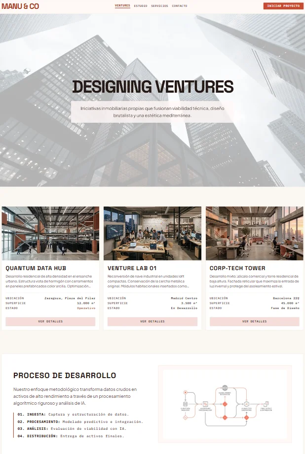
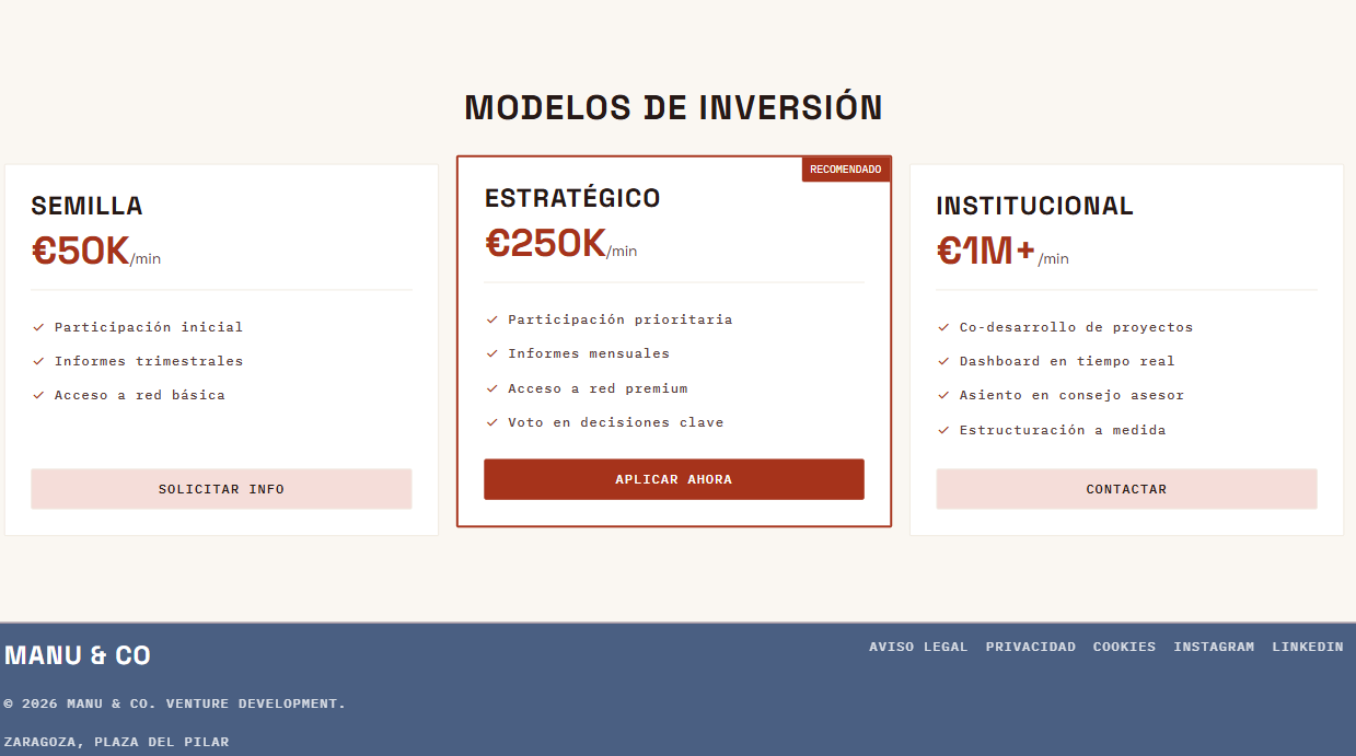
Visual Coherence Analysis with DESIGN.md:
-
Respect for the Required Color Palette:
- Main background in soft linen (
#FAF7F2) giving it a print warmth. - Primary and featured buttons in terracotta coral (
#C84B31). - Lower block (footer) in deep night blue (
#2D4263) with light text for high legibility.
- Main background in soft linen (
-
Tri-Font Typographic Hierarchy:
- Headlines (
Clash Display): Headlines ("DESIGNING VENTURES", "DEVELOPMENT PROCESS", "INVESTMENT MODELS") use bold uppercase with wide tracking and enormous presence. - Body text (
Albert Sans): Clean and readable paragraphs for descriptions. - Metadata and Technical UI (
Fira Code): Used strictly for utility labels in uppercase (LOCATION: Zaragoza/Madrid/Barcelona, AREA, STATUS, prices in €/min and footer menu).
- Headlines (
-
Card and Button Structure:
- Cards: No bloated floating shadows or excessive effects. Clean borders, adjusted paddings, and compact internal grid for the technical data of each project.
- Buttons: Sober buttons with
border-radius: 4pxin terracotta coral (APPLY NOW,START PROJECT) and soft variants for secondaries (VIEW DETAILS,CONTACT).
The goal of the method is clear: the AI builds exactly the design boundaries declared in the visual contract, achieving a clean, readable interface 100% coherent with our DESIGN.md.
2. Create a Development Contract that Shields the File (AGENTS.md)
In long conversations, the AI tends to forget the instructions from the beginning due to context displacement. To prevent it from reverting to generic fonts mid-project, we create an AGENTS.md file (or .cursorrules) that acts as a System PromptGlosarioSystem PromptInstrucción de nivel superior proporcionada a un modelo de inteligencia artificial antes de procesar las peticiones del usuario. Establece las reglas de comportamiento, restricciones de estilo, contexto arquitectónico y contratos de diseño (como archivos AGENTS.md o CLAUDE.md) que el agente debe respetar estrictamente durante toda la sesión de interacción.Ver término completo →. Its main function is to force the AI to consult DESIGN.md before generating code (for a complete breakdown of the three-layer contract architecture, see our knowledge section guide on Guided UI Design for AI Agents).
Why do we use XML-style tags in
AGENTS.md?
- Context Scoping: Modern language models (such as Claude or GPT) are trained to process XML tags. Delimiting instructions within system tags (for example,
<web_designer_rules>) tells the assistant that this content is a rigid behavioral contract and not a simple conversational suggestion.- Attention Anchoring: Opening and closing tags prevent key rules (like consulting
DESIGN.mdor not using bloated margins) from diluting as the conversation grows.- Modular Referencing: Allows you to invoke specific rules in the chat by simply saying "Build this component respecting the
AGENTS.mdcontract and theDESIGN.mdtokens".
<!-- Example instruction in the prompt to link the contract: -->
"Review the `AGENTS.md` file before writing any component. Remember the golden rule: every color, typeface, background geometry, card style and visual structure must come strictly from the rules declared in `DESIGN.md`."
3. Fix the Style System Consuming DESIGN.md
Once your DESIGN.md is defined, don't let the AI choose libraries at random or inject hardcoded colors into the code. Explicitly require it to build elements consuming the rules declared in your document (including cards and tables with grid divs).
<!-- Bad (Vague prompt): -->
"Make me a product card for the homepage."

<!-- Good (Prompt tied to DESIGN.md): -->
"Build a product card using the style defined in section 4 of `DESIGN.md`: background `--surface`, subtle border `var(--border)`, compact 1rem padding, corners `border-radius: 4px` and the icon aligned horizontally next to the title in Clash Display font without independent tinted containers."
4. Replace Adjectives with Exact References to DESIGN.md
Words like "elegant", "clean" or "impactful" mean nothing to a machine. To get exactly what you want, replace ambiguous adjectives with direct references to the sections of your DESIGN.md.
<!-- Bad (Adjective-based prompt): -->
"Make me a modern, elegant and clean button with a soft shadow."

<!-- Good (DESIGN.md referencing prompt): -->
"Create a main button using the Fira Code font from `DESIGN.md`, background `--accent` (coral), light text `--surface`, subtle 4px rounded corners (border-radius: 4px) from section 5, and the hover elevation described in the document."
5. Micro-interactions and Compact Density Tied to the Base
Don't ask for "cool animations" that load heavy JavaScript libraries. Ask for native CSS micro-interactions and compact designs that respect the adjusted paddings declared in your DESIGN.md.
<!-- Bad (Vague prompt): -->
"Add visual effects and interactions to the dropdown blocks."

<!-- Good (Motion and structure prompt tied to DESIGN.md): -->
"Build the FAQ section using accessible details and summary blocks with subtle borders `--border`, compact 1rem paddings and a smooth CSS transition according to sections 5 and 7 of `DESIGN.md`. Include the prefers-reduced-motion rule."
Practical Example: The AGENTS.md Contract that Protects DESIGN.md
Below is an example of a system rule structured in XML blocks for your AGENTS.md or CLAUDE.md file. Its goal is to act as a "guardian" that prevents the AI from straying outside your DESIGN.md specifications:
<system_directives>
  <web_designer_rules>
    You are an elite web designer and frontend developer focused on visual craftsmanship, information density, and strict adherence to style guides.

    GOLDEN RULES OF THE PROJECT:
    1. PROHIBITION OF GENERIC UTILITY CLASSES (VARIABLE SYSTEM):
       - Before writing any HTML or CSS component, you MUST read and consult the `DESIGN.md` file.
       - Strictly forbidden to hardcode hex colors, invent typefaces (forbidden Inter, Roboto, Outfit, Plus Jakarta Sans, JetBrains Mono, Space Grotesk) or use generic utility classes outside those declared in `DESIGN.md`. All styling must be done via Vanilla CSS or native SCSS.
    2. INFORMATION DENSITY AND ODIOUS PROHIBITION OF EXCESSIVE PADDINGS:
       - Strictly forbidden to use bloated paddings or margins (e.g. 32px, 48px or 64px inside cards).
       - Containers must be compact and intense: maximum internal padding of 1rem (16px) on desktop and 0.75rem (12px) on mobile. Visual space must be maximized, emulating the utilitarian precision of a technical IDE.
    3. BACKGROUND GEOMETRY (NO TO GENERIC SUBTLE GRIDS):
       - Forbidden use of the worn-out resource of subtle grids or radial light micro-gradients by default. Demand alternative geometries such as octagon patterns, triangular patterns, or isometric lines in native CSS with reduced opacity.
    4. CARD AND CONTAINER STANDARD (CARDS):
       - Background `--surface`, subtle border `var(--border)` and subtle 4px rounded corners (`border-radius: 4px`).
       - Icons aligned horizontally to the title (`flex items-center gap-2`), forbidden to wrap icons in independent tinted square boxes.
    5. PROFESSIONAL BUTTONS AND GEOMETRY (BORDER-RADIUS 4PX):
       - Forbidden the use of abrupt clip-path polygon cuts or bloated corners (rounded-full).
       - Buttons and interactive elements must use subtle 4px rounded corners (`border-radius: 4px`), background `--accent`, `Fira Code` text and subtle 1px border.
    6. DATA TABLES IN GRID DIVS:
       - Forbidden to use HTML <table> or inline styles. Tables must be laid out obligatorily with divs in grid, alternating `--bg` and `--surface-raised` rows with `--accent` headers.
    7. ACCESSIBILITY AND MOTION:
       - Use animations in native CSS always respecting the rule `@media (prefers-reduced-motion: reduce)`.
  </web_designer_rules>
</system_directives>
Dive Deeper into the Technical Documentation
If you want to see a complete implementation with code of this design system (HSL variables, polygonal patterns with clip-path and CSS animations), you can consult our complete guide in the knowledge section: Guided Design System for AI Agents.